The year 2017 is full of surprises and new avenues as LinkedIn has introduced new features and upgraded its interface.
Yes, that’s right! LinkedIn is pulling the right trigger and trying to create the benchmark with its new interface. Will these new upgrades be able to generate influence on users compare with its previous interface?
Let us explore LinkedIn’s navigation and figure it out.
1.Discover LinkedIn’s- New Homepage:-
The new version has more clear and conscious layout. With deep teal color menu bar and labeled icons is pleasing.
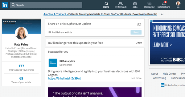
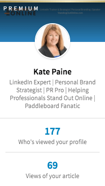
The professional profile has added two new features that of who view your profile recently and views of the articles.
Even the content sharing section has new options to share an article, photo, or update.

However, nothing has changed in the LinkedIn feeds.
2.Upgraded Me Section:-
The unique Me Section is nothing else but a renew Profile Section. Both Mobile or Desktop versions has similar navigations in Me Section. The size for the background photo is 1536 x 768 pixels and profile picture size change.
If you want to edit the intro section, click the pen icon and add the unique summary that completes your profile. You can add your name, current position, education, country, industry, professional headline, etc.
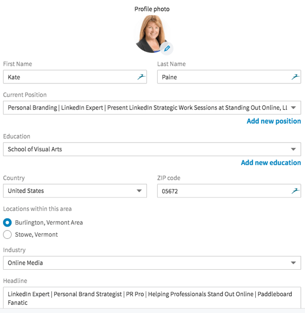
Now you can just edit, view or change settings of your profile only by clicking on the Me Icon. Professionals looking out for complete access to all features must upgrade to premium account.
Wherein, a new section is developed to add Accomplishments. Professional can include projects, courses, publications, certifications, honors and awards, and patents.
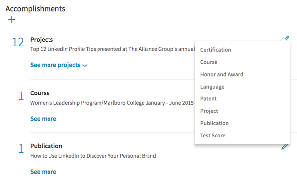
Job seekers can still add on their Experience, Education, Volunteer Experience & Causes, etc. In the new profile, you can adjust its display as the right sidebar or within the profile. The end of the Me Section is the companies and people that you follow.
However, the customized URL on your profile has the switch with the plain URL. Now LinkedIn allows adding description next to the URL.
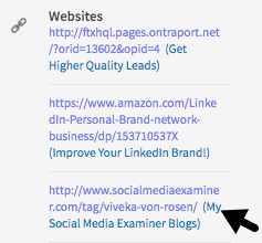
Well, we’re sure having description would strengthen the impact of your profile on recruiters.
3.Revamped Search Results:-
The major change is that the new interface can no longer filter searches by Keywords, name, title, and Zip code. With No Advance Search Option, we wonder if is this a good move. After all Job Seekers need to revise and experiment with search options.
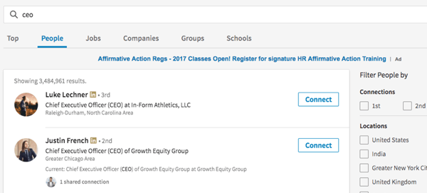
Though LinkedIn still has kept the old school filters by the level of connections, general locations, companies, industries, profile language, non-profit, languages, and education. You can still use the use Boolean search option without Advance Search.
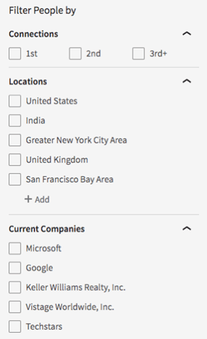
Although, LinkedIn has removed the saved searches and tagging but includes Premium Feature ‘Sales Navigator’ for three-month free trial. Users who have not yet used it can access saved and advanced searches, and tagging.
So, let us see if the free version of LinkedIn with a limited number of search option will it be the user-friendly interface or not.
4.Better & New Notifications:-
The improved Notifications now get a section. The new interface makes the view interactive for the users. View the Connections-
- Work Anniversaries.
- Read New Published Articles.
- Find People Mentioned in the news.
- Your connections Birthdays.
- Figure out your connections Promotions or New Job.
- Notified People who followed you.
- Know People who engage with your articles.
- Discover People who endorse you.
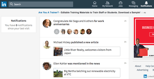
It might create a better connection with your acquaintances and recruiters.
5.My Network Interface:-
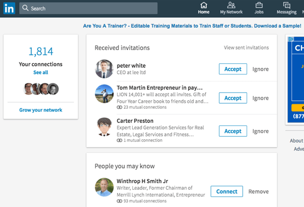
The new interface lets you accept, connect, message, and remove your connections. LinkedIn excluded all the sorting features and tags. It is a significant change brought by LinkedIn.
6.LinkedIn More Option:-
The ‘More’ Option is available in LinkedIn’s Mobile application is back on the Desktop version. Now users can access to multiple features and some premium features.
- LinkedIn Learning
- Post a Job
- Groups
- ProFinder
- Lookup and SlideShare
- Talent Solutions
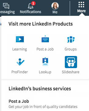
Users can easily use Profinder, SlideShare, and Look Up that is a part of the premium features.
LinkedIn wants users to have more satisfaction with the new interface upgrade.
So, let see if the users will benefit from these new improvisations and LinkedIn be able to pull the right strings.
What do you think about the new interface? We would like to know your views. Feel Free to comment down below and stay tuned for more latest updates.
How can we share any post to my linkedin groups.
I do not like it. It appears that many of the features that were available for free such as who has looked at your profile, can now only be obtained in a premium subscription. LinkedIn is being short sighted here and I see some push back.
I actually like the new UX of LinkedIn. It was about time they enrolled this update because every other social platform is also using similar UX structure. The new interface made navigation easy. Interaction is convenient, now more than ever, load time is better, the overall functionality seems more satisfactory.
Many new features have been introduced and a lot of old features have been removed, making way for what’s usable, rather, what’s applicable. I like the fact that now people are able to view the exact number of followers when they visit someone’s profile. Apart from that, the in-depth, inbuilt analytics allow a person to view how many people viewed their profile. I find it really savvy.